# Valores ilustrativos baseados no exemplo didático de Gordis, Epidemiologia, 5ª ed., 2017
# Os valores são aproximados e servem para demonstrar o conceito — consulte a fonte original
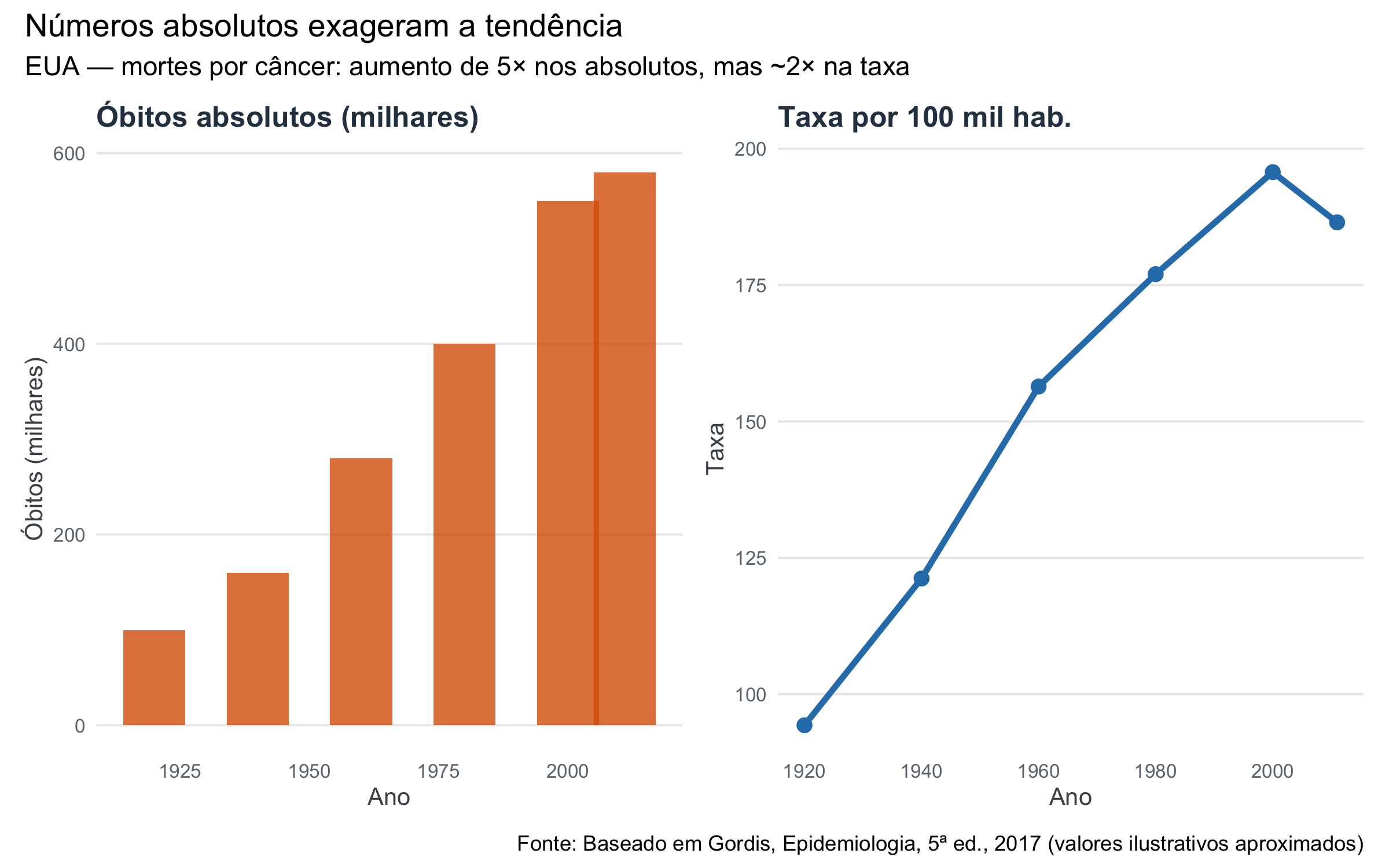
eua_cancer <- tibble::tribble(
  ~ano, ~obitos_mil, ~pop_milhoes, ~taxa_100mil,
  1920,  100,  106, 94.3,
  1940,  160,  132, 121.2,
  1960,  280,  179, 156.4,
  1980,  400,  226, 177.0,
  2000,  550,  281, 195.7,
  2011,  580,  311, 186.5
)

p1 <- ggplot(eua_cancer, aes(x = ano, y = obitos_mil)) +
  geom_col(fill = cores_indicadores["alerta"], alpha = 0.8, width = 12) +
  scale_y_continuous(labels = label_number(big.mark = ".")) +
  labs(title = "Óbitos absolutos (milhares)", x = "Ano", y = "Óbitos (milhares)") +
  tema_indicadores(base_size = 10)

p2 <- ggplot(eua_cancer, aes(x = ano, y = taxa_100mil)) +
  geom_line(color = cores_indicadores["destaque"], linewidth = 1.2) +
  geom_point(color = cores_indicadores["destaque"], size = 2.5) +
  labs(title = "Taxa por 100 mil hab.", x = "Ano", y = "Taxa") +
  tema_indicadores(base_size = 10)

p1 + p2 +
  plot_annotation(
    title = "Números absolutos exageram a tendência",
    subtitle = "EUA — mortes por câncer: aumento de 5× nos absolutos, mas ~2× na taxa",
    caption = "Fonte: Baseado em Gordis, Epidemiologia, 5ª ed., 2017 (valores ilustrativos aproximados)"
  )